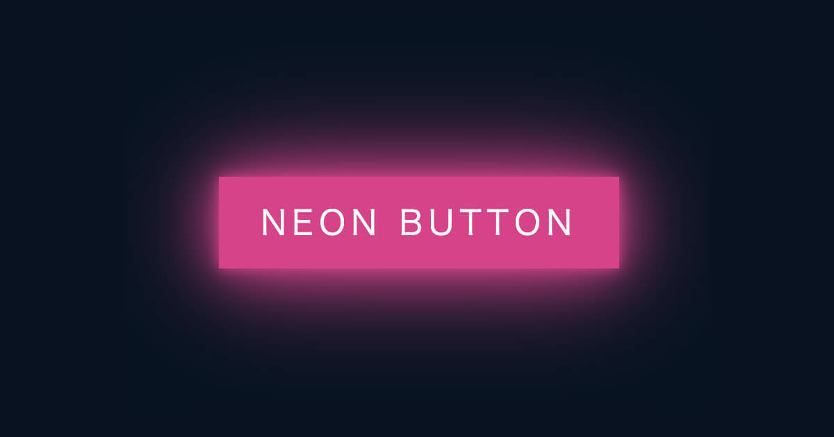
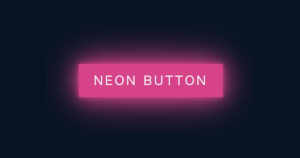
ネオンのように光るボタンをホバーエフェクトで作成してみました。ダークなサイトなんかに使えそうです。
目次
ネオンのように光るホバーエフェクトボタン【CSS】
HTML↓
<!DOCTYPE html>
<html lang="en">
<head>
    <meta charset="UTF-8">
    <meta name="viewport" content="width=device-width, initial-scale=1.0">
    <title>ネオンのように光るホバーエフェクトボタン【CSS】</title>
    <link rel="stylesheet" href="style.css">
</head>
<body>
    <a href="#">
        <span></span>
        <span></span>
        <span></span>
        <span></span>
        Neon Button
    </a>
</body>
</html>
CSS↓
*{
    margin: 0;
    padding: 0;
    box-sizing: border-box;
}
body{
    display: flex;
    justify-content: center;
    align-items: center;
    min-height: 100vh;
    background: #031321;
}
a{
    position: relative;
    display: inline-block;
    padding: 15px 30px;
    color: #e62f8b;
    text-transform: uppercase;
    letter-spacing: 4px;
    text-decoration: none;
    font-size: 24px;
    overflow: hidden;
    transition: .2s;
}
a:hover{
    color: #fff;
    background: #e62f8b;
    box-shadow: 0 0 10px #e62f8b, 0 0 40px #e62f8b, 0 0 80px #e62f8b;
    transition-delay: 1s;
}
a span{
    position: absolute;
    display: block;
}
a span:nth-child(1){
    top: 0;
    left: -100%;
    width: 100%;
    height: 2px;
    background: linear-gradient(90deg,transparent,#e62f8b);
}
a:hover span:nth-child(1){
    left: 100%;
    transition: 1s;
}
a span:nth-child(2){
    top: -100%;
    right: 0;
    width: 2px;
    height: 100%;
    background: linear-gradient(180deg,transparent,#e62f8b);
}
a:hover span:nth-child(2){
    top: 100%;
    transition: 1s;
    transition-delay: 0.25s;
}
a span:nth-child(3){
    bottom: 0;
    right: -100%;
    width: 100%;
    height: 2px;
    background: linear-gradient(270deg,transparent,#e62f8b);
}
a:hover span:nth-child(3){
    right: 100%;
    transition: 1s;
    transition-delay: .5s;
}
a span:nth-child(4){
    bottom: -100%;
    left: 0;
    width: 2px;
    height: 100%;
    background: linear-gradient(360deg,transparent,#e62f8b);
}
a:hover span:nth-child(4){
    bottom: 100%;
    transition: 1s;
    transition-delay: 0.75s;
}
HTMLの解説
<a>タグの中にボタンの枠を走るラインになる<span>を4つ作成します。HTMLはたったのこれだけです。
CSSの解説
その1 <a>タグの設定
a{
    position: relative;
    display: inline-block;
    padding: 15px 30px;
    color: #e62f8b;
    text-transform: uppercase;
    letter-spacing: 4px;
    text-decoration: none;
    font-size: 24px;
    overflow: hidden;
    transition: .2s;
}
a:hover{
    color: #fff;
    background: #e62f8b;
    box-shadow: 0 0 10px #e62f8b, 0 0 40px #e62f8b, 0 0 80px #e62f8b;
    transition-delay: 1s;
}
<a>タグの設定を行います。
テキストのバランスを調整してposition:relative;を設定します。これを使って<a>タグを基準にして下で解説する<span>の位置を決定します。
ホバー時には背景色を足して、シャドウを加えます。box-shadowはbox-shadow: X軸 Y軸 ぼかし具合 色;の順番で設定できます。しかもカンマで区切ることで、重ねてボックスシャドウをかけることができます。今回は同じ影を3重にすることで、ネオンのような光を再現しています。
その2 <span>タグの設定
a span{
    position: absolute;
    display: block;
}
a span:nth-child(1){
    top: 0;
    left: -100%;
    width: 100%;
    height: 2px;
    background: linear-gradient(90deg,transparent,#e62f8b);
}
a:hover span:nth-child(1){
    left: 100%;
    transition: 1s;
}
<span>は説明したように、<a>タグを基準にしてposition:absolute;で位置を指定しています。それぞれ、ボタンの上下左右のボーダーラインを再現します。このボーダーラインの位置を初期値とホバー時で変えて、transitionで時間を設定することで、アニメーションのように動いて見えます。あとはtransition-delayで開始時間をずらしてボーダーラインがボタンの周りを1秒かけて一周するように設定するだけです。これでネオンボタンの完成です。
まとめ
今回はネオンのように光るボタンをCSSだけのホバーエフェクトを使って作成しました。単純なコードで再現しやすいので、参考にしてみてください。ボタンに限らず、テキストにネオンのような雰囲気を出すのにもbox-shadowが使えるので重ね書きして好みのデザインにして見るのも楽しいかもしれませんね。