
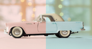
BAKE抹茶チーズタルトのサイトのメインビジュアルのホバーエフェクトが好きだったので、真似てみました。Javascriptを使ったホバーエフェクトを使っているので、ぜひ参考にしてみてください。
目次
BAKEのMVのホバーエフェクトを真似てみた【webデザイン】
HTML↓
<!DOCTYPE html>
<html lang="en">
<head>
    <meta charset="UTF-8">
    <meta name="viewport" content="width=device-width, initial-scale=1.0">
    <title>BAKEのMVのホバーエフェクトを真似てみた【webデザイン】</title>
    <link rel="stylesheet" href="style.css">
</head>
<body>
    <div class="outer">
        <div class="left">
            <div class="bg_left"></div>
        </div>
        <div class="right">
            <div class="bg_right"></div>
        </div>
    </div>
    <script src="https://cdnjs.cloudflare.com/ajax/libs/jquery/3.5.1/jquery.min.js"></script>
    <script src="my.js"></script>
</body>
</html>
CSS↓
*{
    margin: 0;
    padding: 0;
    box-sizing: border-box;
}
body{
    height: 100vh;
    width: 100%;
}
.outer{
    position: absolute;
    top: 50%;
    left: 50%;
    transform: translate(-50%,-50%);
    width: 100%;
    height: 600px;
}
.left{
    transition: 1.5s cubic-bezier(0.72, 0, 0, 1);
    position: absolute;
    top: 0;
    left: 0;
    width: 50%;
    height: 100%;
    overflow: hidden;
}
.right{
    transition: 1.5s cubic-bezier(0.72, 0, 0, 1);
    position: absolute;
    top: 0;
    right: 0;
    width: 50%;
    height: 100%;
    overflow: hidden;
}
.bg_left{
    position: absolute;
    left: 0;
    background: url(p1.jpg) no-repeat center;
    background-size: cover;
    width: 100vw;
    height: 100%;
}
.bg_right{
    position: absolute;
    right: 0;
    background: url(p2.jpg) no-repeat center;
    background-size: cover;
    width: 100vw;
    height: 100%;
}
JS↓
$(function(){
    $('.left').hover(function(){
        $(this).css('width','90%')
        $('.right').css('width','10%');
    },function(){
        $(this).css('width','50%')
        $('.right').css('width','50%');
    });

    $('.right').hover(function(){
        $(this).css('width','90%')
        $('.left').css('width','10%');
    },function(){
        $(this).css('width','50%')
        $('.left').css('width','50%');
    });
})
CSSの解説
.left{
    transition: 1.5s cubic-bezier(0.72, 0, 0, 1);
    position: absolute;
    top: 0;
    left: 0;
    width: 50%;
    height: 100%;
    overflow: hidden;
}
.right{
    transition: 1.5s cubic-bezier(0.72, 0, 0, 1);
    position: absolute;
    top: 0;
    right: 0;
    width: 50%;
    height: 100%;
    overflow: hidden;
}
.bg_left{
    position: absolute;
    left: 0;
    background: url(p1.jpg) no-repeat center;
    background-size: cover;
    width: 100vw;
    height: 100%;
}
.bg_right{
    position: absolute;
    right: 0;
    background: url(p2.jpg) no-repeat center;
    background-size: cover;
    width: 100vw;
    height: 100%;
}
.rightと.leftそれぞれwidth:50%;にし、position:absolute;を使って横並びにします。
背景の画像のwidthを100vwに設定し、.rightと.leftにoverflow:hidden;を使うことで、半分の背景だけを表示させます。画像の表示サイズが横に伸びても画像は画面幅に固定されているので、動くことがありません。
JSの解説
$(function(){
    $('.left').hover(function(){
        $(this).css('width','90%')
        $('.right').css('width','10%');
    },function(){
        $(this).css('width','50%')
        $('.right').css('width','50%');
    });

    $('.right').hover(function(){
        $(this).css('width','90%')
        $('.left').css('width','10%');
    },function(){
        $(this).css('width','50%')
        $('.left').css('width','50%');
    });
})
jqueryを使ってホバーエフェクトの設定をしていきます。
.leftにホバーすると.leftの幅を90%に伸ばし、.rightの幅を10%に縮ませます。ホバーを解除するとそれぞれ50%に戻るように設定しています。.rightも同様に設定しています。
まとめ
今回の実装は割と簡単なものでしたが、見た目はクールなのでメインビジュアルに採用するには面白いかもしれません。BAKEのサイトのように初めに動きを追加するだけでクオリティがグンと上がりそうですね。ぜひwebデザインの参考にしてみてください。